
Building a viz like this is insanely easy in Excel with PowerPivot. Especially in Excel2013.
Here's how. Let's walk through building one to slice up some AW Product Sales and find out what subcategories produce 80% of all sales.
Dataset: AdventureWorksDW (just Products and ResellerSales to keep it simple)
Moving Parts:
- 1 calculated measure that sums the desired outcome (eg. Sum of ExtendedAmount)
=SUM(FactResellerSales[ExtendedAmount])
- 1 calculated measure that returns the Target Percentage
(fixed at 80% for our Pareto target line - we can parameterize this with a disconnected table later)
=0.8
That's it for the PowerPivot model side. Now let's build the viz in a PivotChart.
From a blank PivotChart: follow these steps:
1. Add the 2 calculated measures from above (Sum of ExtendedAmount & the Pareto Target) to the Values box.
2. Now add another copy of the Sum of ExtendedAmount (we'll use this for our running total). Prior to Excel2013, you'd have to make a second copy of the actual measure in the model, but now in Excel2013, you can use the same measure twice.
3. Drop Product SubCategory in the Chart Categories box and sort it descending on SumSales.
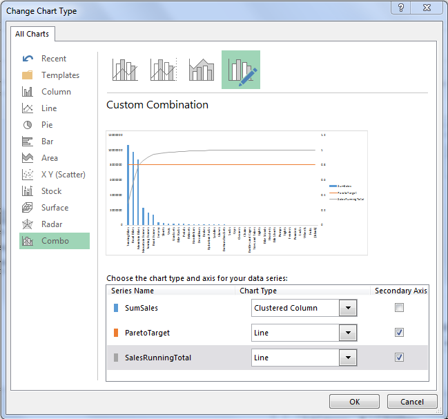
At this point, you should have something like this:

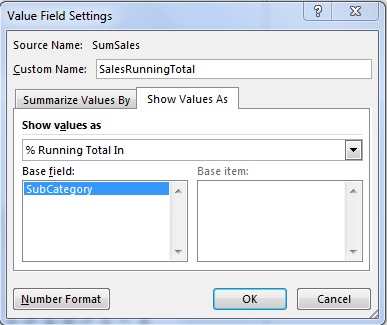
5. Select a data series and change the Chart Type for both the ParetoTarget series and the SalesRunningTotal series to Line Chart on the secondary axis.
That's it. Piece 'o Cake, huh?
You can obviously clean it up a bit more with some of the following if you like:
- Remove Gridlines (from chart and worksheet)
- Add a slicer for Product Category
- Lock the Secondary axis Max at 100%
- Set the Primary Axis to display in Thousands to minimize real-estate taken up by labels
- Add a disconnected table with Percentages to hook to your ParetoTarget (if you want to be able to easily flip between 80%, 90%, 70%, etc).
- Modify the data series colors and use a theme or toned down shades.
- Insert a logo.
- and on and on...
You get the idea. Endless possibilities for customization. Here's my working example for reference.
The main point here is that, to get to the core viz, and the insights it can uncover, it was actually quite simple. Once you get the running total percentage and understand the secondary axis approach, it's too easy... TOO easy...

No comments:
Post a Comment